Redesigning NAVIT’s Mobility Platform
NAVIT is a mobility benefits platform that helps employees manage services like public transport, bike leasing, and mobility budgets.
When I joined, users struggled to understand what they had, how to use it, and where their budget was going, leading to low feature adoption and high support volume.
Over 2.5 years, I led the redesign of the mobile app and key product experiences, focusing on making complex benefit structures clear, predictable, and usable from the first interaction.
This included redesigning onboarding, budget allocation, and transaction history, as well as establishing a scalable design system and continuous feedback loops across teams.
What shipped

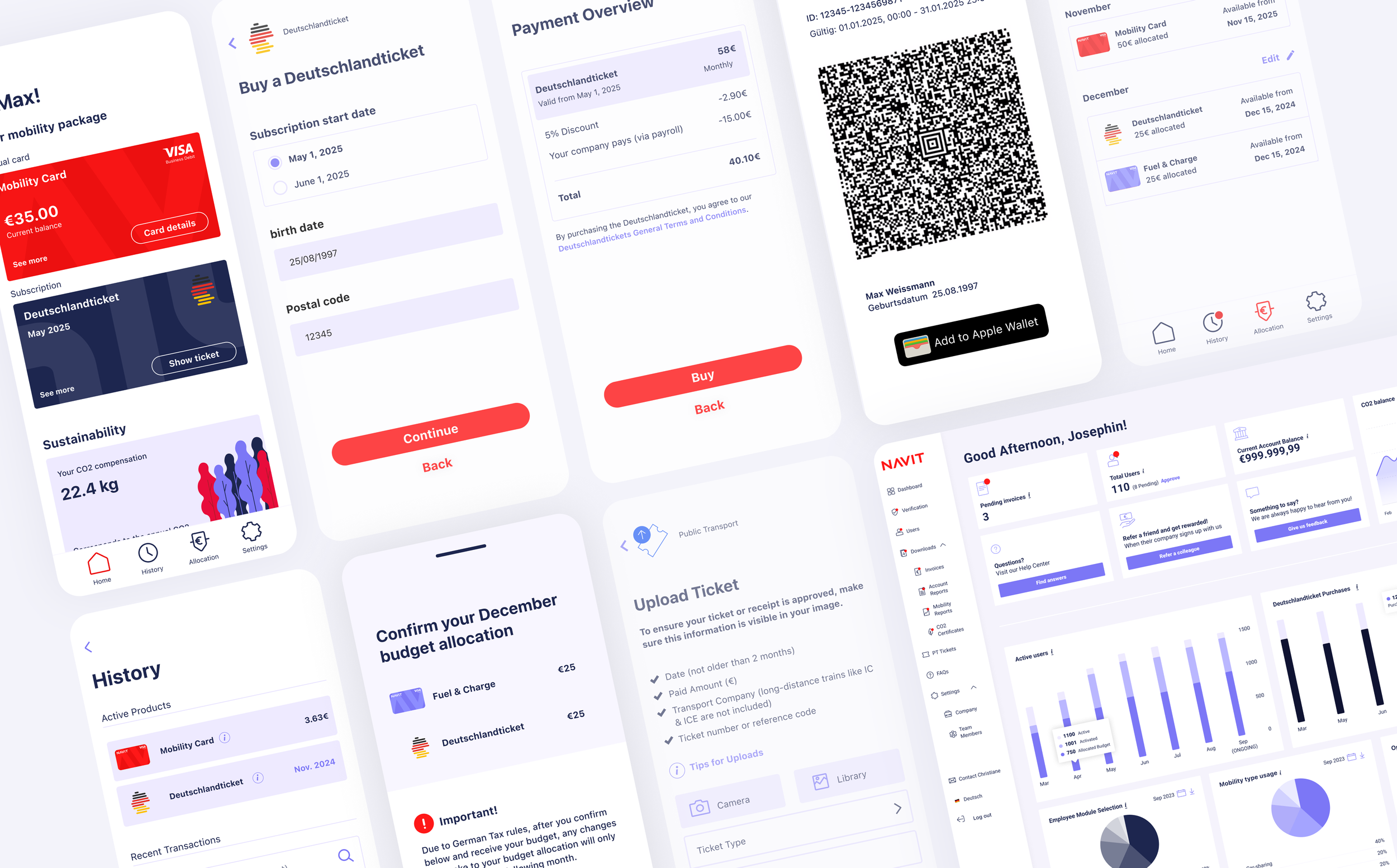
Redesigned onboarding to clearly show available benefits and guide users into action
Rebuilt budget allocation so users can assign and adjust budgets intuitively
Introduced a clear transaction and balance system (available, used, upcoming changes)
Removed misleading UI patterns (e.g. “credit card” metaphor) that caused incorrect assumptions
Designed and launched key features including Deutschlandticket and Bike Leasing
Established the foundations of a shared design system across mobile and web, improving consistency and handoff
Impact
The Challenge
When I joined NAVIT (formerly RYDES), users struggled to understand how their benefits worked—what they could use, how to change them, and where their budget was going. This lack of clarity led to:
Confusion and frustration
Low adoption of key features
High support workload for the team
On top of that, the app’s visual language created false expectations. All benefits were presented as prepaid cards, leading users to believe they behaved the same. Complex offerings like reimbursements, and bike leasing were misunderstood or underused.

“I don’t know why anyone would choose public transit or bike leasing if the red card includes everything.”
— New User
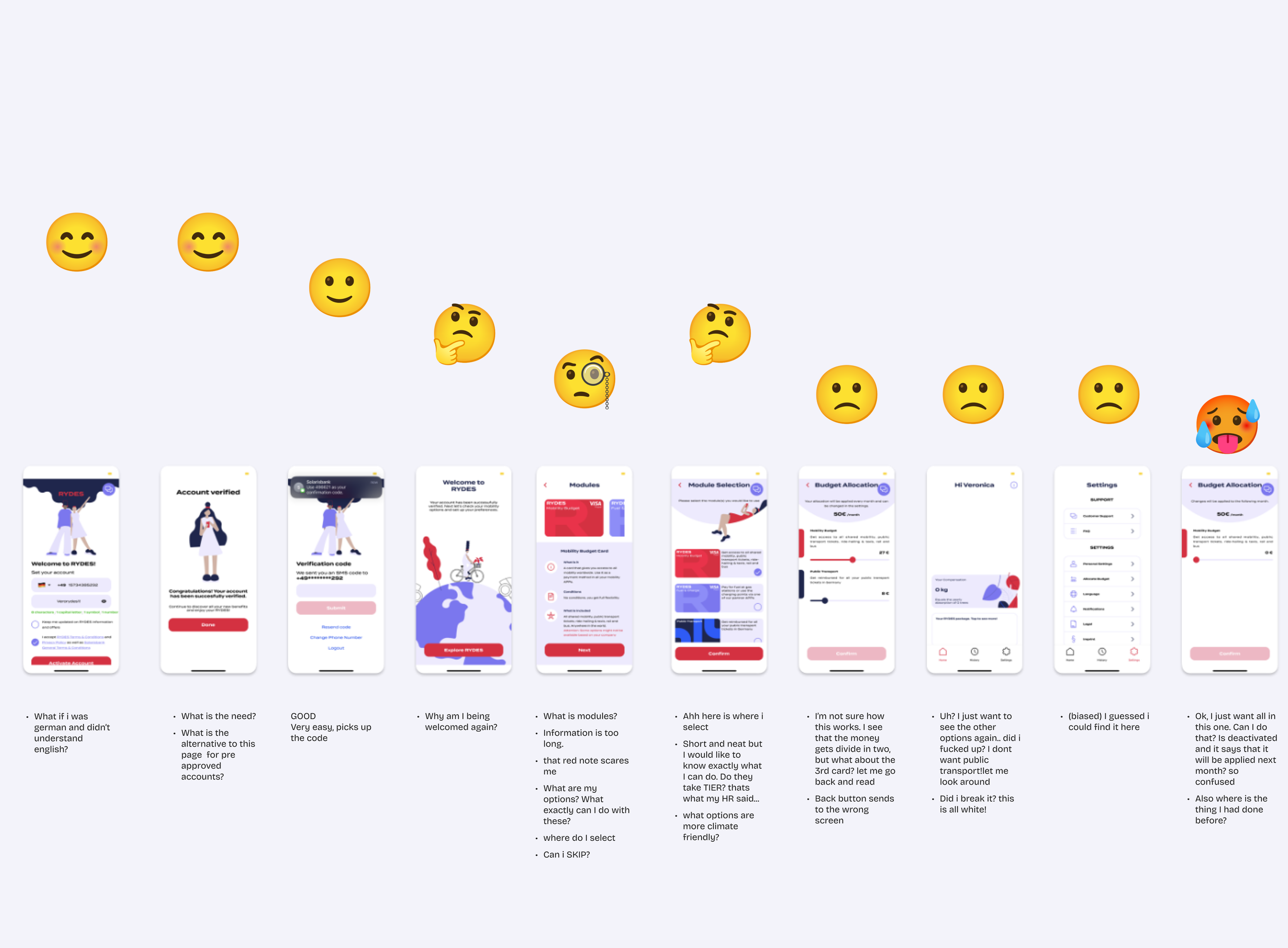
Phase 1: Evaluation & Quick Wins
Goal: Identify usability blockers and implement low-effort, high-impact improvements to reduce friction.
Evaluation
Before proposing any design changes, I conducted a heuristic evaluation of the existing app and onboarding flow to understand where users struggled and which issues most affected activation and comprehension.
This surfaced several critical usability gaps:
Redundant steps during account setup
Poor information hierarchy (key actions hidden behind secondary screens)
Inconsistent use of word “Product” and “Module” to refer to all different offerings
Overloaded onboarding screens that mixed education and configuration, giving overwhelming first-time experience with too much information too early
Unclear budget behavior (what comes in, what goes out)
No way to change the app language before you fully onboard
Supporting Data
Only 31% of users selected more than one product, even though 77% were eligible
Users waited an average of 47 days to create a second product
These patterns suggested that product experience—not user intent—was the main barrier.

Quick Wins Implemented
To deliver immediate improvement, I focused on low-effort, high-value fixes:
Moved the budget allocation tool to the main menu and introduced labeled icons to make it easier to discover and understand.
Updated typography to SF Pro and Roboto for better readability and performance
Added early language selection to prevent premature churn
Merged product descriptions and selection into one screen for clarity
Consistently use the word “Product” to refer to different offerings
These updates improved onboarding flow and comprehension, laying the foundation for deeper structural work.
With these quick wins validated, I moved into a broader redesign focused on clarity, scalability, and alignment with user mental models.
Phase 2: Clarifying Budgets and Improving Allocation Flow
Goal: Help users see, plan, and adjust their budgets intuitively while clarifying how benefits and allocations actually work.
Building on Phase 1 insights, I redesigned the onboarding and allocation experience to better reflect users’ mental models of “what they get” and “how they can use it.”
Onboarding Improvements
The original onboarding included four overloaded screens mixing education and setup. I condensed it into a clearer two-step flow:
Show what the company provides: users first see their monthly mobility budget and what it can be used for.
Guide directly into allocation: instead of abstract setup, users immediately assign their budget across products.
Removed “Credit Card” design for all products to avoid false equivalency
This change aligned the experience with user expectations and reduced early drop-off by making the value of the benefit tangible from the start.
Allocation & History Redesign
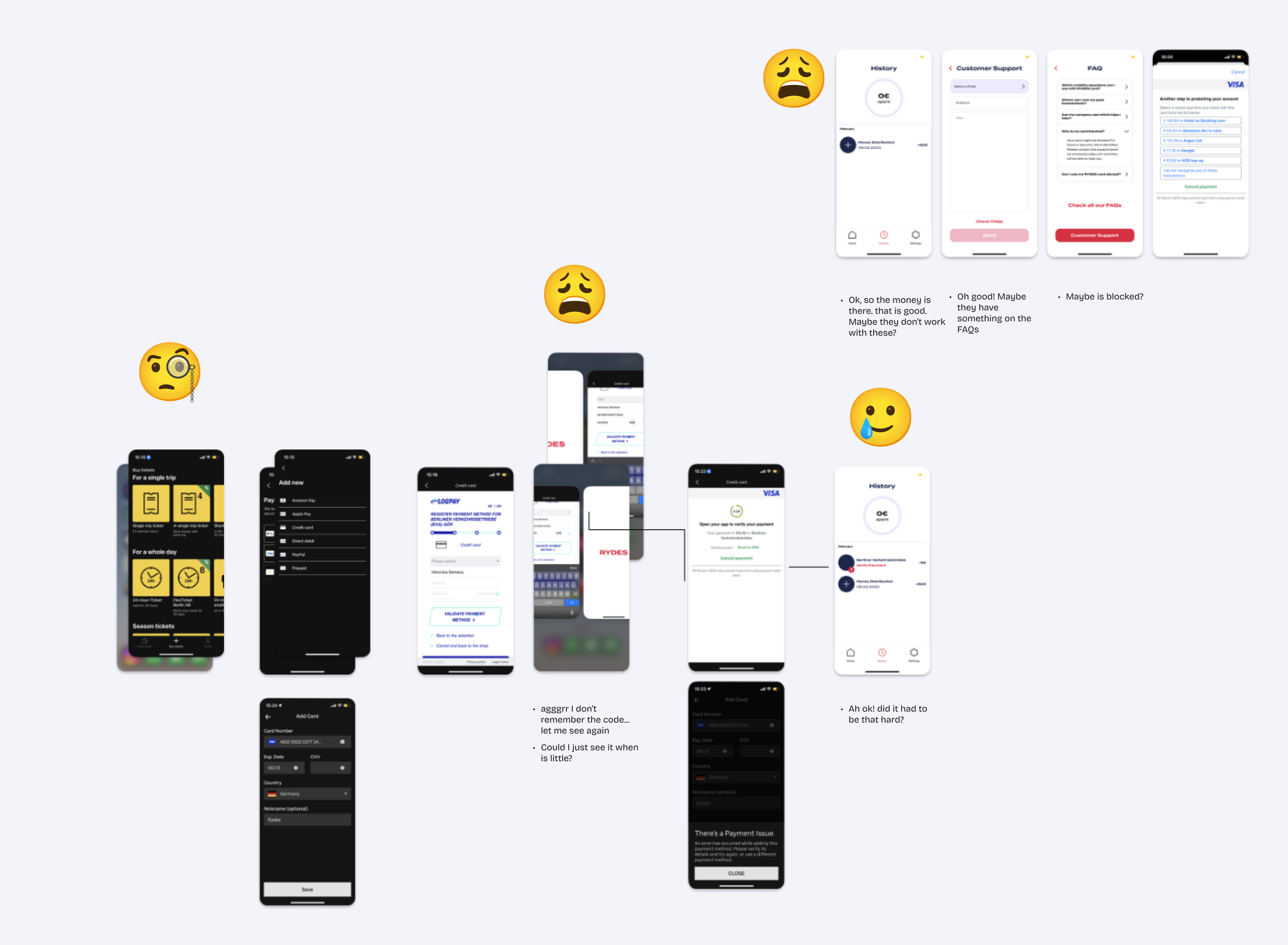
Users consistently told Support they didn’t understand what their displayed balance meant:

“I’m not sure if the number at the top is what I have left, what I got, or what I’ve already used. It’s different every time.”
To fix this, I restructured the allocation and history experience around clarity and predictability:
Introduced “Current” and “Next” allocation views, showing what’s active now and what changes next month, so users always know when edits take effect.
Added inline company policy reminders (info button) to reduce confusion and keep context visible.
Introduced confirmation screens showing when edits take effect
Updated balance logic to display the available amount per product, not total spend.
Redesigned transaction entries to clearly distinguish between money added, spent, or reimbursed.
Together, these changes gave users a stable understanding of their budgets and reduced Support tickets related to allocation and history issues while driving a measurable increase in multi-product activation.

“Now I can see that each number is for each card, like on the homepage. Makes sense.”
— User during testing
Phase 3: Scaling the Design Practice
As NAVIT’s app matured, my focus expanded beyond UX improvements to building scalable design operations and fostering cross-functional alignment.
New Feature Development
While refining the overall app experience, I also led the design of several major product launches and a full company rebrand.
Key feature initiatives:
Deutschlandticket: Designed and shipped the MVP in under a month, despite minimal information available at the national rollout. This allowed us to be one of the first benefit providers in Germany to offer the ticket through our app.
eBike Subscriptions: integrated with Dance, allowing flexible monthly rentals directly through the app.
Bike Leasing: Designed the integration of Deutsche Dienstrad into the NAVIT app, enabling employees to lease bikes and access tax benefits seamlessly.
Each initiative involved creating new user flows, building UI components, and testing with users.
As the product offering expanded, these additions revealed the need for a scalable, reusable design system to ensure consistency and efficiency across the app.
HR & Operations Dashboard
Alongside the employee-facing app, I also redesigned key areas of the company dashboard used by HR and operations teams.
This included improving workflows for:
Mobility policy configuration and benefit tiers
Budget allocation and reimbursement management
Payment, fee, and payroll-related workflows
Reporting and operational dashboards
Cross-platform consistency between employee and admin experiences
The goal was to make a highly configurable system feel clearer and more manageable for non-technical HR users while aligning operational, financial, and employee-facing workflows across the platform.
Design System Implementation
When I joined, there was no design system, just manually duplicated components and inconsistent UI. Together with Product Designer Afra Saneinejad, I led the creation of NAVIT’s first scalable design system:
Audited existing UI patterns
Built a shared Figma library
Partnered with Engineering to implement MUI-based components, ensuring Figma–MUI parity
This system reduced design–dev iteration time by 30–50%, improved handoff clarity, and brought consistency across app and dashboard.
In parallel, I mentored Afra in UX research foundations, component building, and multi-track feature design, helping them grow into a confident, independent product designer.
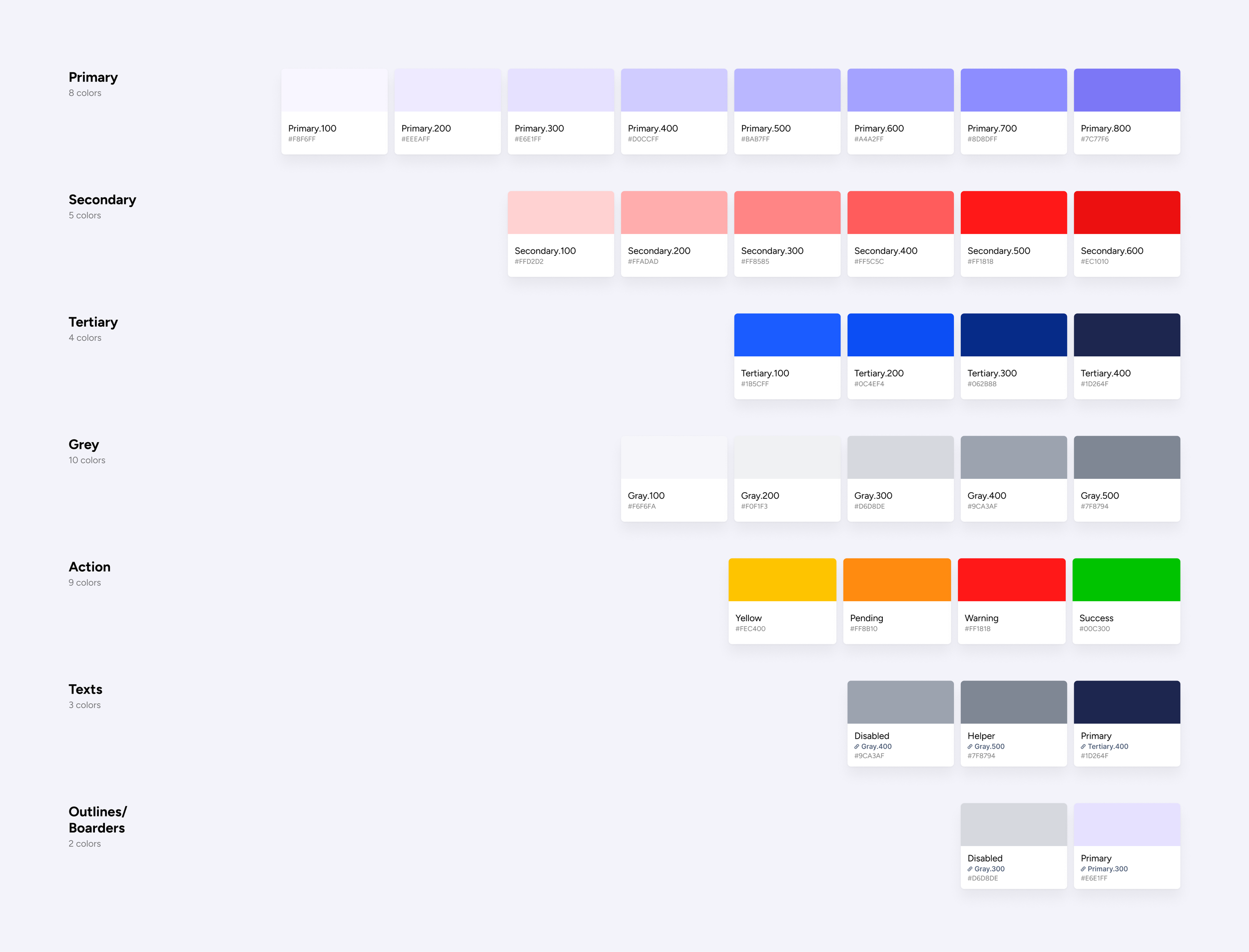
NAVIT Color Library
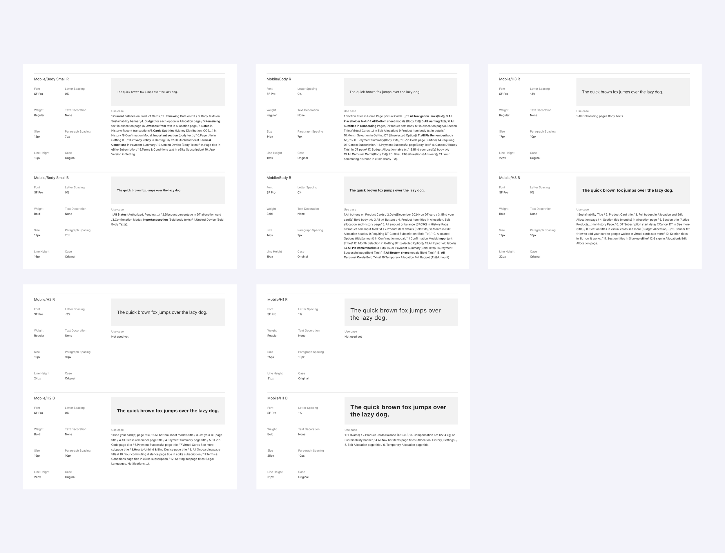
NAVIT Font Design Guidelines
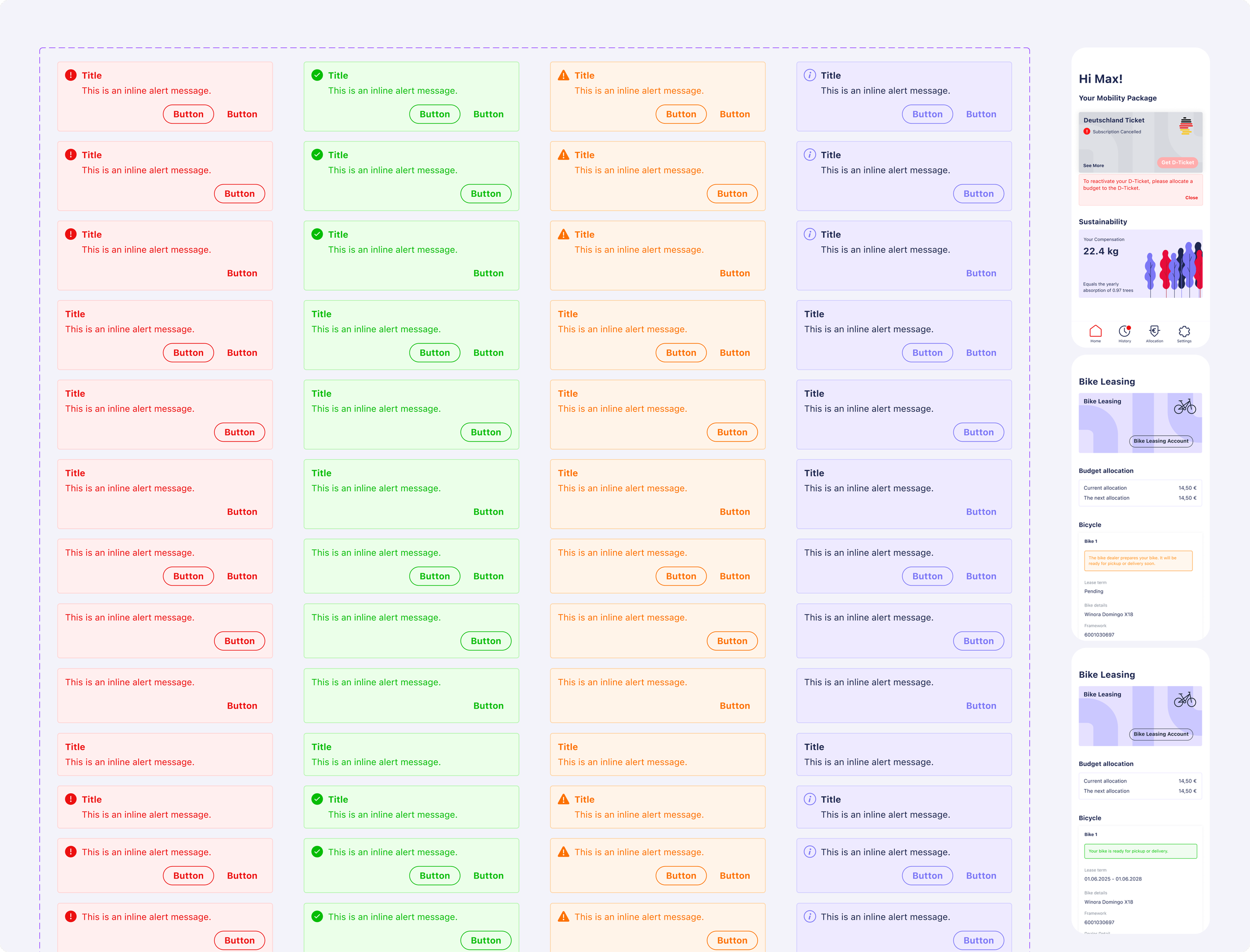
Screenshot of a web interface showing multiple rows of alert messages in different colors: red, green, orange, and purple, each with a title, message, and a button, organized in columns with different themes.
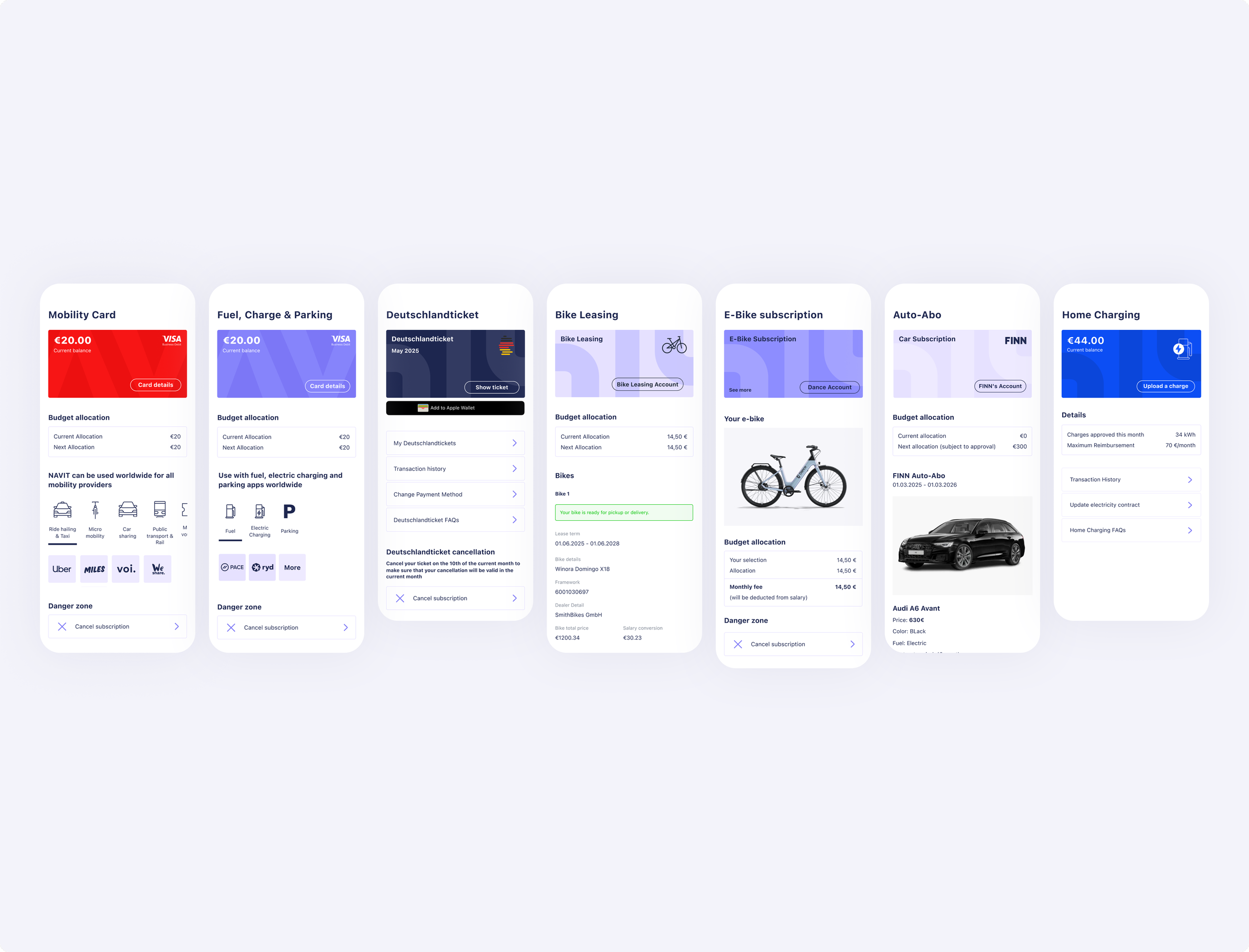
Collection of digital screens displaying various transportation and utility apps, including mobility card, fuel and parking, Germany ticket, bike leasing, e-bike subscription, auto-Abo, and home charging interfaces.

App Design Audit
Continuous Feedback Loops
I built continuous communication channels between Product, Support, and Customer Success so real user pain points fed directly into our design backlog and prioritization. This included regular syncs and a simple ritual: I ran a short user test with new joiners during their first days at the company. New employees were first-time users: their fresh perspective helped surface obvious usability issues quickly, and the sessions doubled as a hands-on onboarding for them.
These lightweight loops ensured issues reported by Support were investigated quickly and validated with real users before we designed fixes.
Impact
Product Impact
Multi-product activation increased from 31% → 49% after the allocation redesign
Account activation friction reduced: users reached first purchase faster and with fewer errors
Adoption rate rose to 90%+, driven by clearer benefit and budget logic
Improved comprehension of “what’s left to spend”: users reported the app “finally makes sense”
Onboarding completion improved through early language selection and simplified setup
Business Impact
Support tickets related to allocation and purchase-history issues dropped by roughly 50% over time.
Faster Deutschlandticket adoption enabled NAVIT to be among the first providers at national rollout
Clearer benefit communication improved user trust and retention
Team & Process Impact
Figma ↔ MUI design system reduced design–dev iteration time by 30–50%
Introduced structured feedback cadence between Product and Support
Reduced time spent on clarification and QA during handoffs
Mentored a junior designer into a confident, autonomous contributor
What We Couldn’t Solve
Some limitations were beyond design control:
Users couldn’t add post-tax money to their NAVIT card due to legal/tax constraints, leading to unused budgets
Lack of in-app behavioral tracking limited rapid validation, making us rely on interviews, NPS, and support data
By combining research, design systems, and cross-team collaboration, I helped reshape how users experience and manage mobility benefits—creating clarity for users, efficiency for teams, and cohesion across the product.
This work also laid the foundation for a continuous research practice at NAVIT—which I cover in a separate case study focused on building a scalable feedback loop.