
FORMEL Skin Subscription Conversion Funnel
FORMEL Skin provides remote dermatological treatment through a monthly subscription. These treatments take time to show results, yet many users preferred to “test” the service for just one month to see if it worked.
With new subscription plans, our goal in 2022 was to commit users for longer periods so they could see results before deciding on their next purchase.
My role: Product Designer, focused on acquisition and onboarding new users.
Background
Research showed that FORMEL Skin users wanted to test the treatment for minimal cost and time before committing. The problem was that around the one-month mark, most users entered a “break-in” phase, often experiencing irritation—right when they would need to buy their second month to see improvement.
We tested several solutions, including better onboarding information about the break-in phase, first-two-month discounts, and influencer marketing. This particular project focused on exploring pricing schemes to improve both conversion and retention.
The FORMEL Skin User Journey
In May 2022, my colleague Silvia Ivanova (focused on retention) and I (focused on funnel and onboarding) mapped the full end-to-end user journey. This helped us identify gaps and align on opportunities across both acquisition and retention. We then shared our findings across departments to spark ideas for improving the customer experience—and, ultimately, conversion and retention.
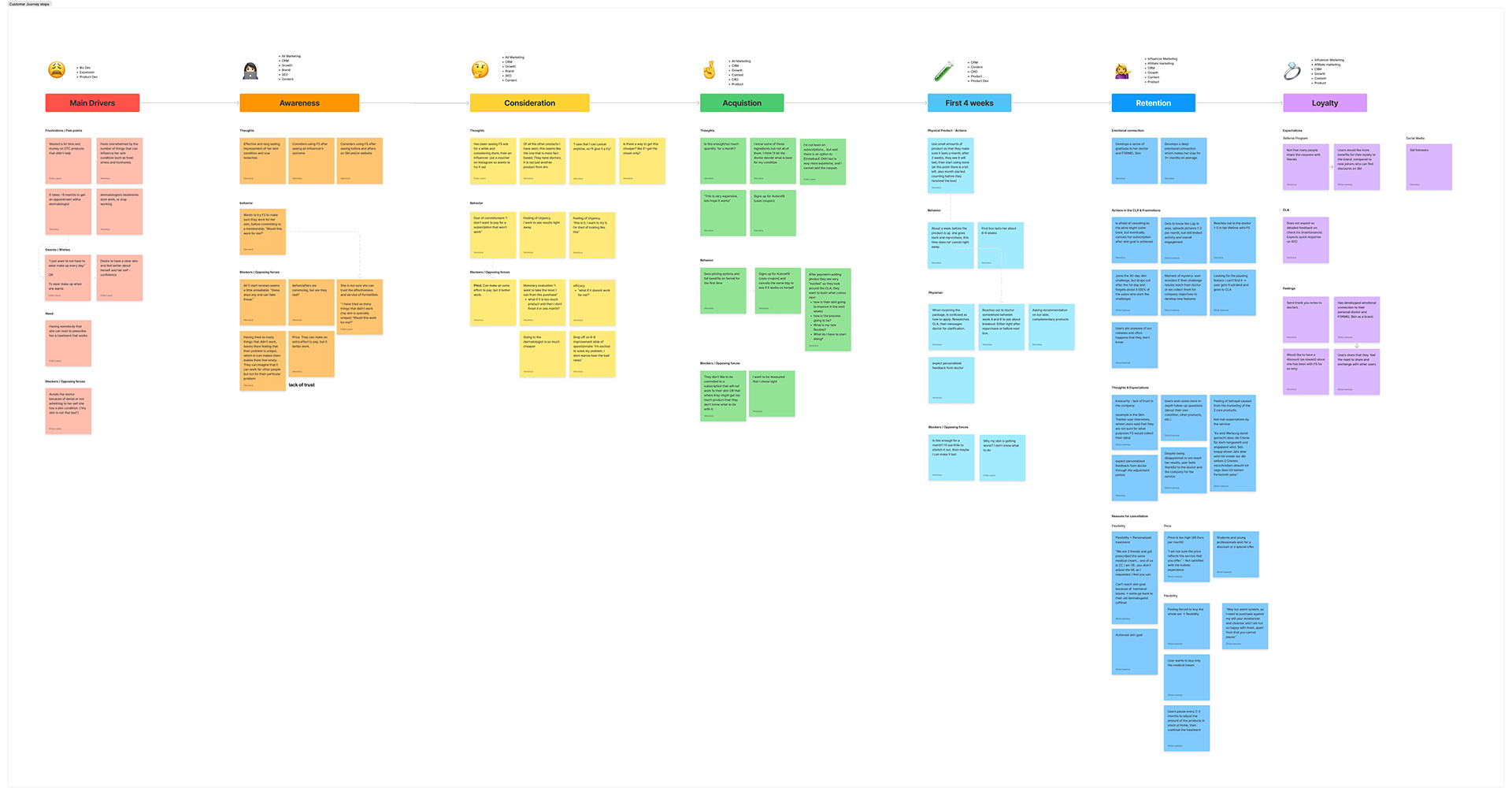
“I don’t want to pay for a subscription that won’t work (for me)”
— User
-
Pain Points
Fear of commitment
Price sensitivity: willingness to pay more if the treatment works, but skepticism before results
-
Opportunities
Introduce an initial low-cost plan to keep users engaged through the 6–8 weeks required to see visible results
Research
The Growth team interviewed customers and explored the feasibility of various plans, including a 2-month option and a longer-term commitment plan.
Competitive Analysis
I reviewed competitor approaches and broader industry examples, identifying both effective presentation standards and patterns to avoid.

Side Note: Previous Optimization of the Plan Selection Step
Earlier in 2022, I had optimized the plan selection step as part of the CRO team. I contributed to ideation, hypothesis creation, and experiment design. Winning changes included:
Moving the coupon input to the cart
Highlighting the Money-Back Guarantee
Enlarging the product box image
Removing visual clutter
Using copy that matched the language patients actually used
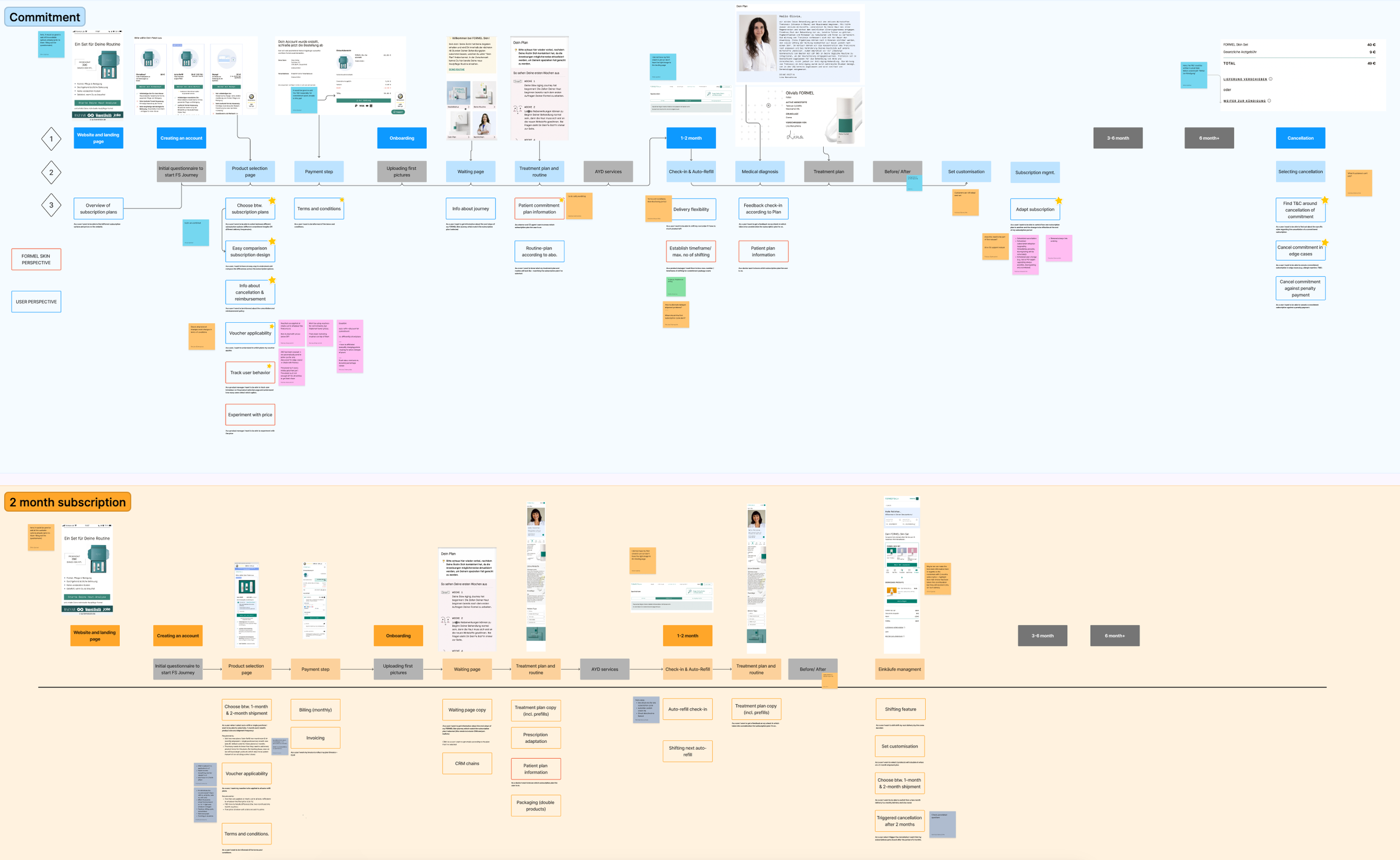
Plan Selection Step – Design Process
Initial Prototypes & User Testing (Test 1)
Initial wireframes broke the decision-making into three smaller steps: what → how → how much. The aim was to avoid overwhelming users and to communicate that longer commitments lead to better results.
Goals
Test whether the 3-step approach improved clarity or created friction
Check understanding of plan details and timing
Identify preferred plans and reasons
Assess UX clarity and pain points
Findings
Users wanted more details about ingredients and what happens if the treatment didn’t work
The commitment package was difficult to understand; many defaulted to “one month and see”
Before-and-after photos were well received
The 2-month plan was understood more quickly, but the 3-month money-back guarantee caused confusion
CRO feedback suggested consolidating all decisions into one screen to reduce drop-off

Options (left to right): Minimum effort to more informative (more effort)

Selection
Test 2
Changes based on Test 1 findings and CRO feedback:
Combined all steps into one screen
Linked doctor recommendations directly to the 2-month plan
Removed the complex commitment package in favor of the clearer 2-month plan
Added ingredient details and “what if it doesn’t work” information
Clarified the money-back guarantee as 60–90 days
Findings
Users still preferred to try the product for one month before committing
The 2-month plan offered better clarity, but the timing of offer mattered (more compelling for returning customers)
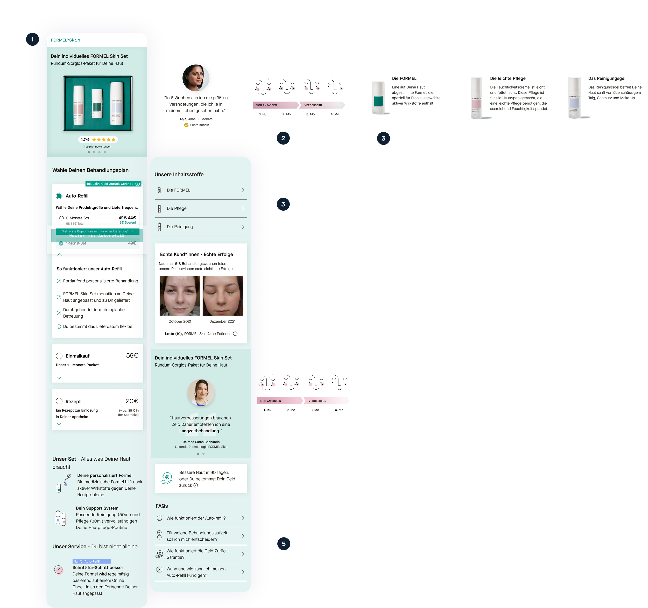
A webpage showing a skincare product set from FORMEL Skin, including product details, treatment plan options, customer reviews, FAQs, and purchase options in a vertical layout.

Comparison of two webpage layouts for FORMEL skin set product, showing product images, treatment options, subscription details, and customer testimonials.
Conclusion
The 2-month plan was A/B tested against current offerings and proved successful. It was later added as an option in the account area, enabling users to switch plans easily.
The redesigned layout provided more relevant information, improving clarity and perceived value. While the new approach reduced friction and supported conversions, there remained potential for further optimization—especially around refining unique selling points, improving information hierarchy, and testing pricing strategies.
A note on UI/Style Guides
When I joined FORMEL Skin, there was no unified style guide or component library. Previous designers copied elements between files. One of my first initiatives was to work with developers to create a synced dev library and Figma library. By July 2022, with help from our design intern Nina Kraus, we had a fully functional, easily updateable design system.