AI-Assisted Product Design in Practice
A 10-day sprint exploring how AI coding tools reshape product design workflows: from concept to a working prototype. During the sprint I defined the product concept, flows, and information architecture, and built the working prototype using AI coding tools. The experiment also included tool exploration and quick usability testing.
I built MoveBetter, an app where employees can get reimbursed for their fitness-related expenses.
Role: Product Designer
Duration: 10 days
Over the past year, AI tools have started to change how digital products can be built. Platforms like Replit, Cursor, and Lovable suggest designers may be able to move beyond static prototypes and create functional applications without engineering support.
I wanted to explore what this shift might mean for product design workflows.
Specifically:
How quickly can a designer move from concept to a working prototype?
How does prompting influence product structure and interaction design?
Where does product thinking still play a critical role in an AI-assisted workflow?
To explore this, I ran an 10-day design sprint, using AI coding tools to build a small working product from scratch.
The Question I Wanted to Explore
-
At the same time, it is still unclear how these tools will fit into a designer’s everyday workflow.
For the past decade, tools like Figma have shaped how designers prototype and collaborate. With AI coding entering the picture, I became curious about what the next evolution of that workflow might look like.
Rather than focusing on a single tool, the goal of the experiment was to understand how AI coding might change the process of designing products itself.
The structure of the sprint was based on a 10-day learning sprint generated with ChatGPT, which I adapted as the experiment evolved.
The goal was not simply to build a prototype, but to better understand how these tools affect the way designers work.tion text goes here
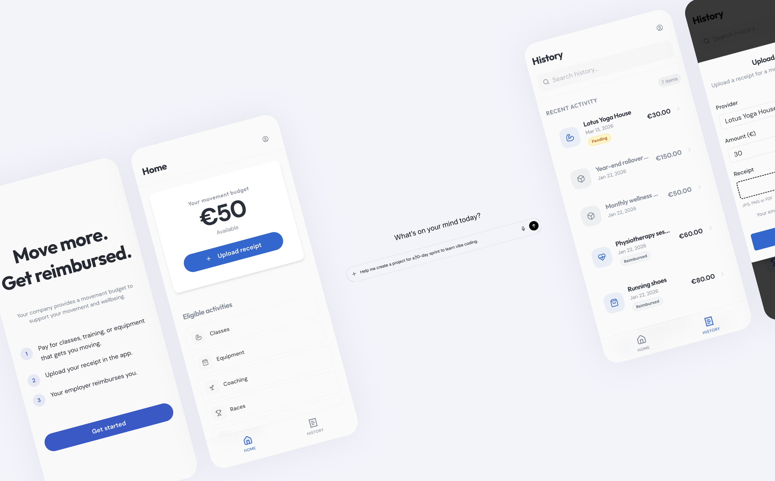
The Product Vehicle
To explore these questions, I designed MoveBetter, a reimbursement-based fitness benefit wallet. Employees receive a monthly movement budget from their employer and can submit receipts for activities such as: fitness classes, equipment, coaching, races, and recovery services.
The concept mirrors real workplace benefit structures and provided a realistic scenario for designing flows and edge cases.
The goal was not to build a full product, but to create a practical test environment for exploring AI-assisted product design workflows.
-
Day 1: Product definition
Day 2: Policy & rules
Day 3: Information Architecture & Core Flows
Day 4: Navigation & Hierarchy
Day 5: Vibe-Coding Setup & First Build
Day 6: "Believability layer" (create states)
Day 7: Goal paths (inclusion + personalization)
Day 8: Usability testing (mini but legit)
Day 9: Analyze interviews & define solutions
Day 10: Implement changes (Prototype v2) -
The experiment was intentionally designed as a short sprint, simulating the rapid exploration designers often do when evaluating new tools.
10-day sprint — moving quickly from concept to working prototype
AI coding tools as the primary interface — building directly instead of designing static screens
No engineering support — all exploration and implementation happened within AI tools
Learning while building — understanding how prompting shapes outcomes
Free-tier tool access — runtime and token limits influenced the pace of development
Quick usability testing with three participants
Process
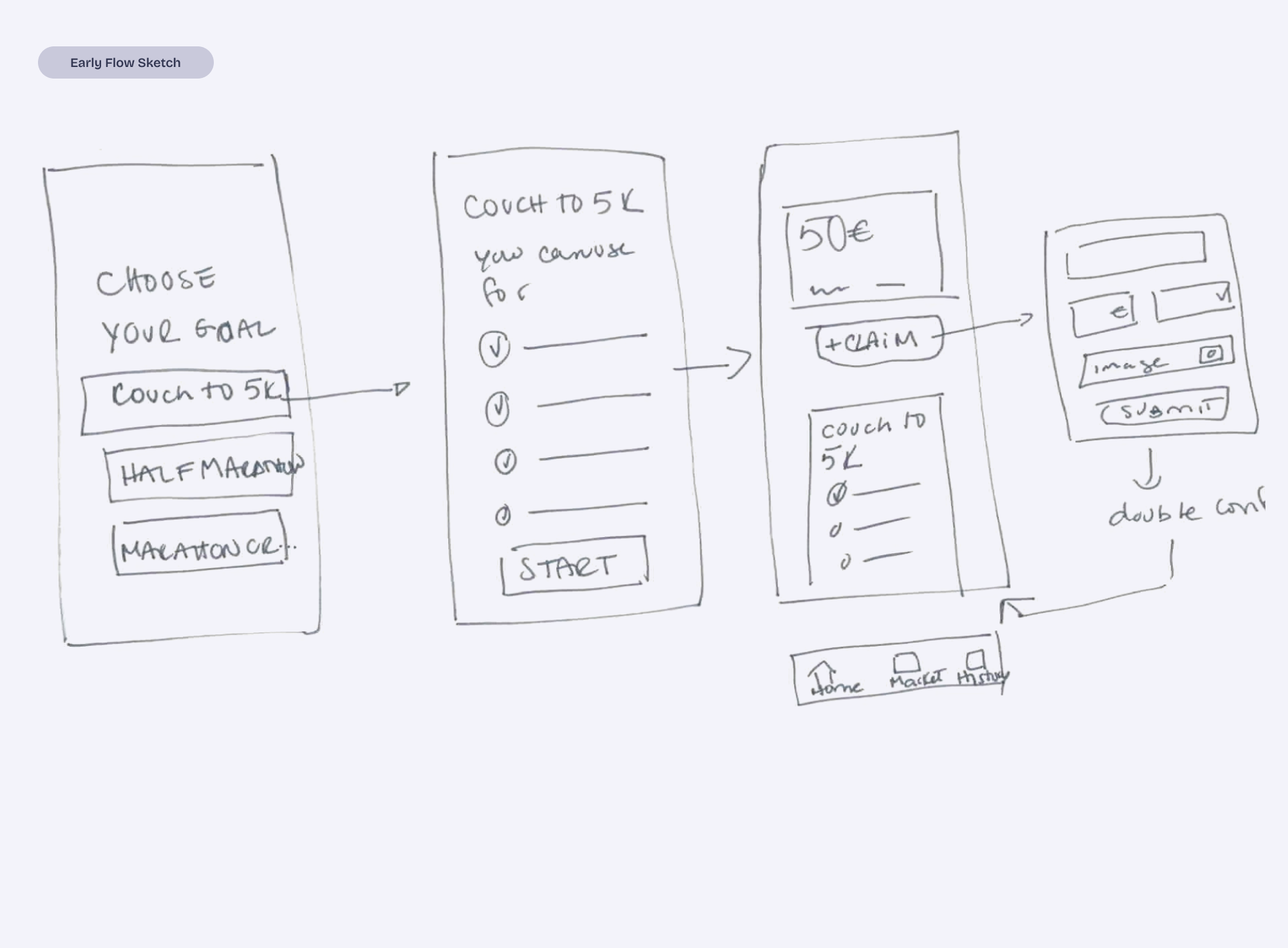
Phase 1: Defining the Product Slice
Before building anything, I defined a small but realistic product scope: a reimbursement flow where users can:
view their movement budget
submit receipts for eligible activities
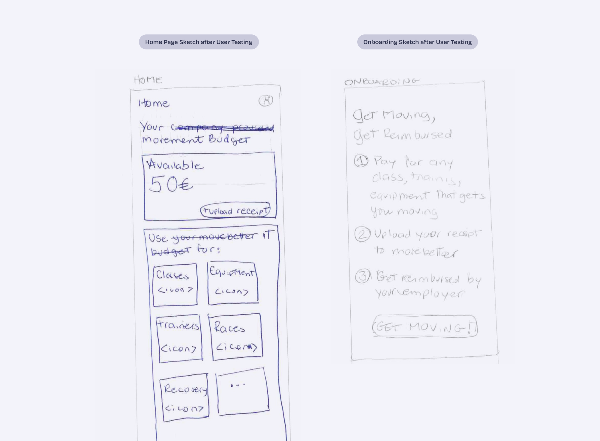
This phase focused on defining the concept, mapping the information architecture, and identifying the minimum interactions needed for the prototype to feel believable. I sketched the flows by hand and pressure-tested the ideas with ChatGPT.
Phase 2: Learning How to Work With the AI
Instead of designing screens, I translated product decisions into prompts that guided both interface and logic.
Part of this phase involved testing different AI coding environments to understand how they behaved when building a real product.
A few patterns emerged quickly:
AI defaults to generic solutions.
Broad prompts produced familiar product patterns.Smaller instructions produced better results.
Breaking work into precise steps helped maintain product structure.Different tools excel at different things.
For example:
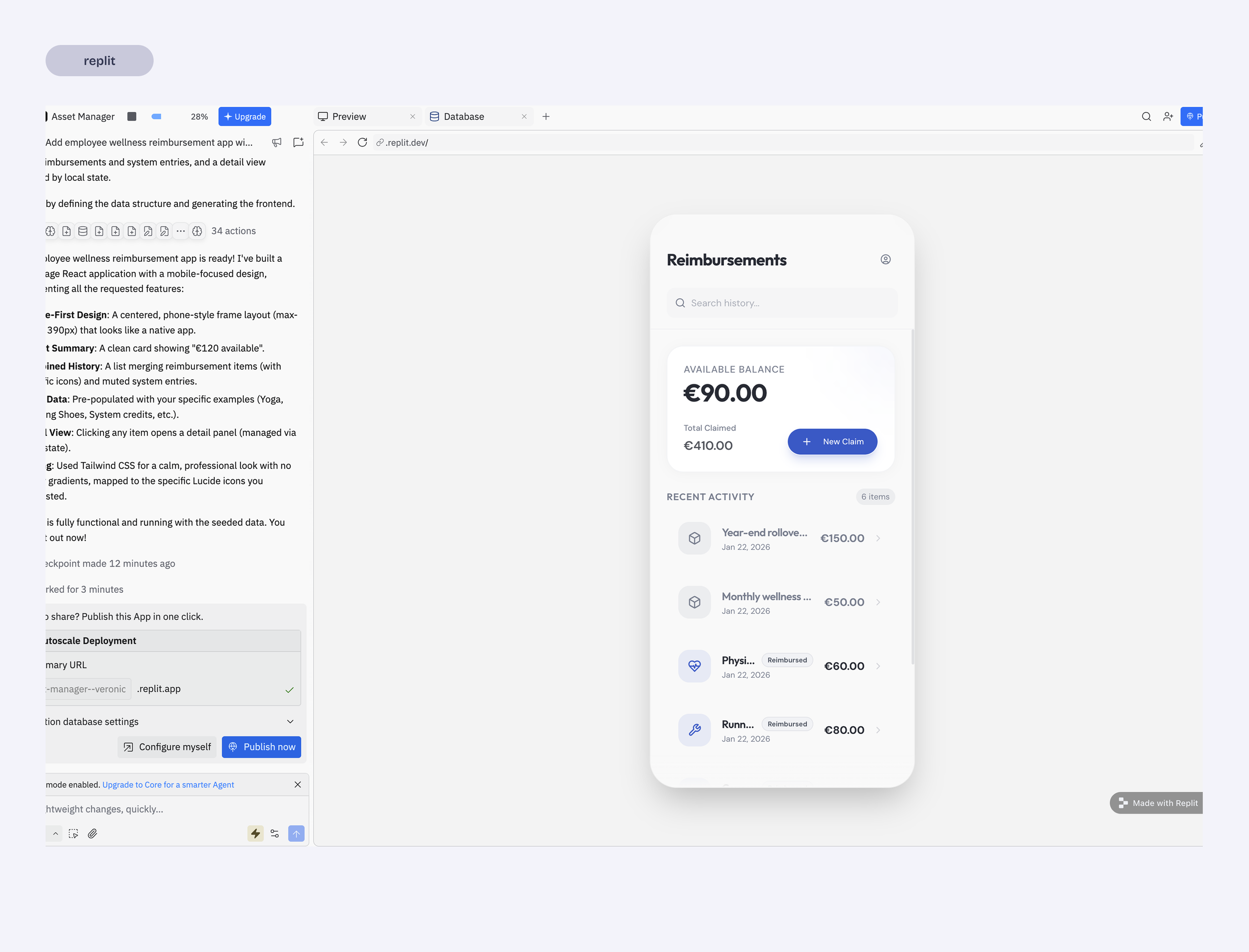
Replit maintained stronger context and often generated more complete flows.
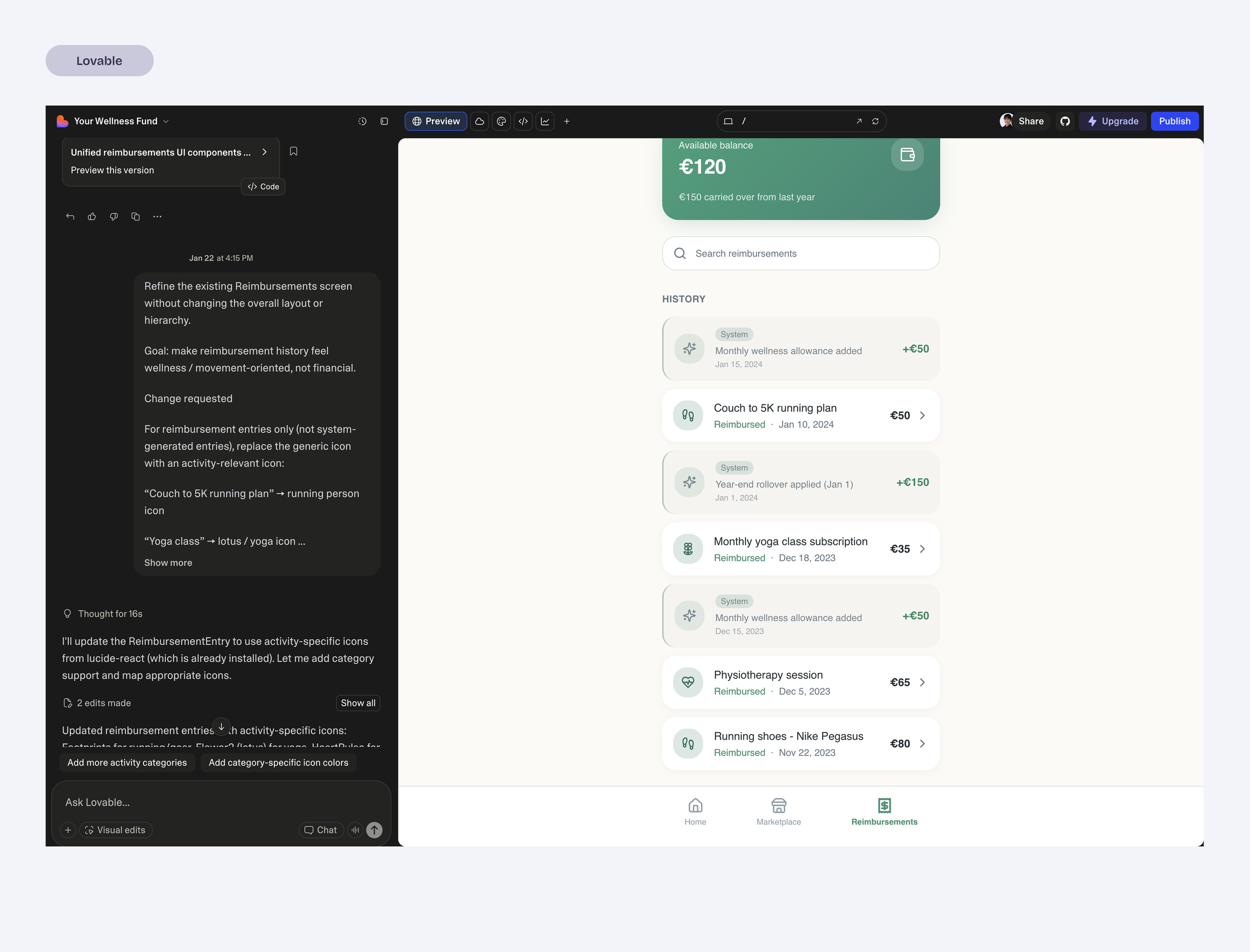
Lovable produced quick UI outputs but required additional prompting to maintain structure.
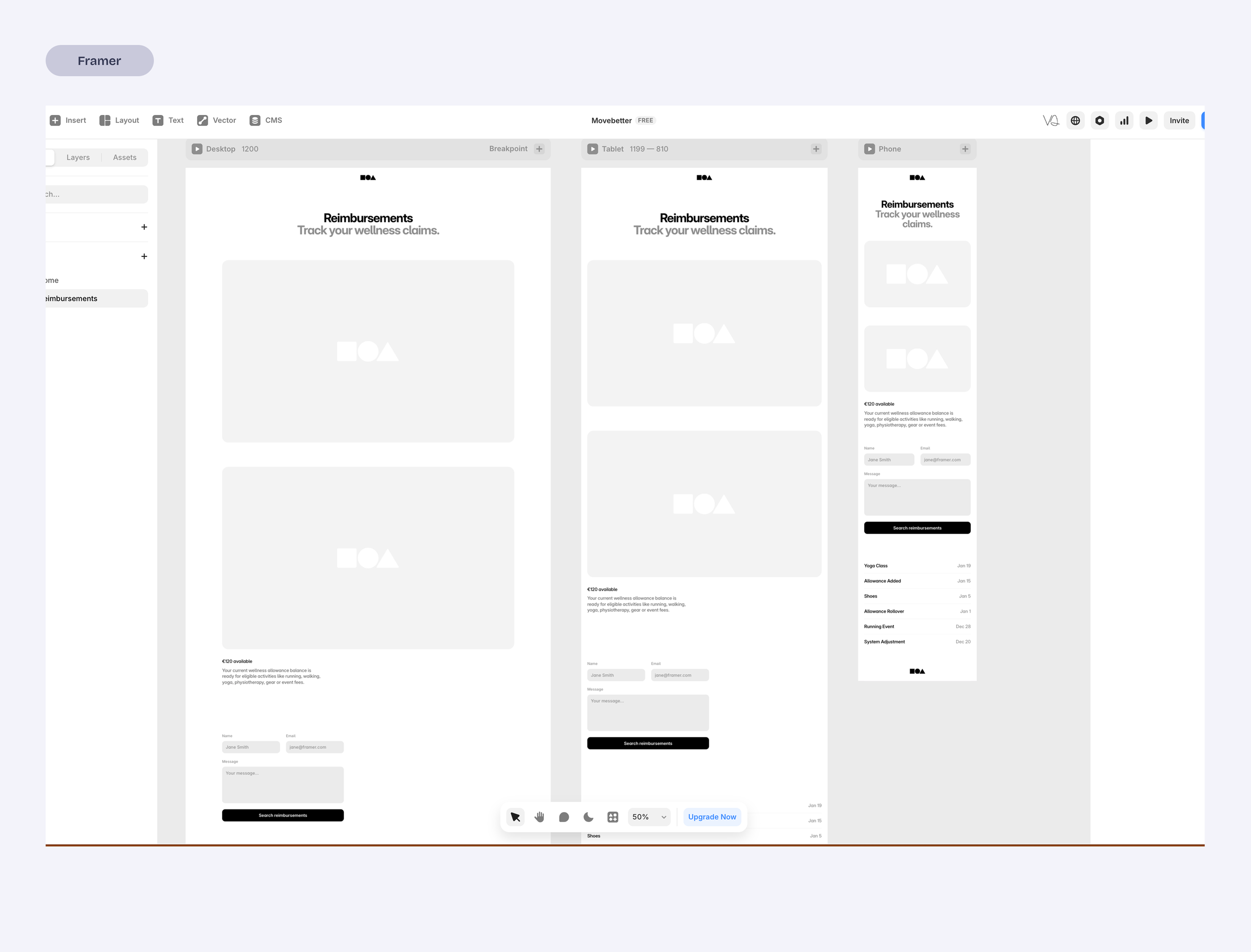
Framer felt better suited for landing pages than product flows.
This phase became less about generating screens and more about learning how to steer the AI so the product stayed coherent.
Phase 3: Making the Prototype Believable
To make the prototype usable for testing, I created simulated states so the interface could reflect:
new user
uploading receipts
reimbursement statuses
This required significant debugging and experimentation. It quickly became clear that believable prototypes need more than good-looking screens, they need to not break when testing and to do so, there is a lot to debug.
Once I got a stable prototype working, I was able to run quick usability tests to observe how people interpreted the flows.
Phase 4: Product Reframing
After testing the prototype, it became clear that the product had been framed incorrectly.
I had initially treated the concept like a fitness app, including elements such as goal tracking.
But the real driver of behavior is financial reimbursement, not activity tracking.
Once that became clear, the product was simplified:
goal tracking was removed
the interface emphasized budget visibility
the main interaction became uploading receipts
This shift clarified the product and made the experience significantly simpler.
Key Product Decisions
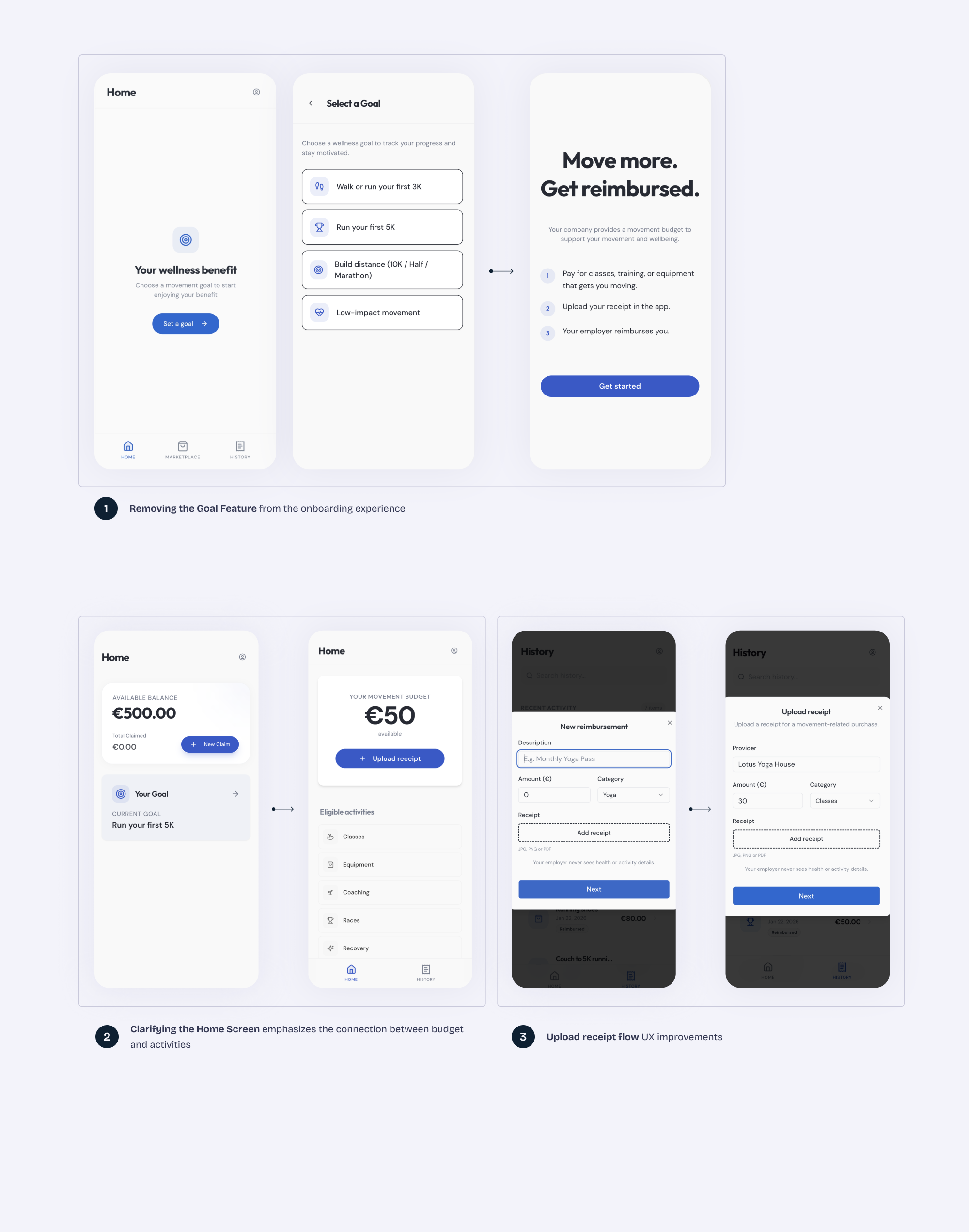
Removing the Goal Feature (1)
Early iterations included goal tracking.
However, usability tests showed that participants consistently interpreted the product as a reimbursement tool, not a fitness tracker.
One participant summarized it clearly:

“If my company is paying for this, I just want to know how much I have left and how to claim it.”
The goal feature added complexity without supporting the product’s core value.
It was removed to keep the experience focused on simple reimbursement.
Clarifying the Home Screen (2)
The new Homepage design communicates the main reason of the app.
Available Budget
Receipt upload
Eligible categories
When a user see these 3 elements together there is no much guessing to do, even if they had skipped the onboarding screen.
Prioritizing Believable Product States (3)
The prototype included simulated states for budgets, receipts, and reimbursement status and flows.
This allowed the interface to behave like a real product and made usability testing significantly more meaningful, which translated into improvements to the onboard and receipt upload states.
Final Prototype
By the end of the sprint, the prototype evolved into a simplified reimbursement flow centered around one core task: submitting receipts against an available movement budget.
The home screen focuses on:
the available movement budget
eligible activity categories
a clear receipt upload action
Because the prototype runs like an actual app rather than a static mockup, participants could open it directly on their phones and interact with it naturally.
What I Learned
AI tools dramatically speed up prototyping.
Moving from idea to a functioning prototype is now possible in a very short time.
AI defaults to generic solutions.
Without clear constraints, systems fill gaps with familiar patterns.Breaking work into small slices works best.
Incremental instructions produced more reliable results than large feature requests.Believable states make prototypes far more useful.
Simulated budgets and reimbursement states made usability testing much more meaningful.Design and implementation are starting to merge.
Instead of designing screens and handing them off, it is now possible to shape the product directly in a working environment.AI accelerates execution, but design thinking still drives the outcome.
-
This sprint started as a way to explore how AI coding tools might fit into a product designer’s workflow.
Building a functional prototype quickly showed how fast ideas can move from concept to something people can actually use. At the same time, it reinforced that the quality of the outcome still depends on how clearly the product is defined and structured.
The tools can accelerate execution, but they don’t replace product thinking — if anything, they make it more important.
The future of design may not be about choosing the right tool, but about learning how to think and build within a new kind of design environment.